Create Your First Project
Start adding your projects to your portfolio. Click on "Manage Projects" to get started
Comcast | National WatchTower Node Analysis - Dark Mode Feature
Project Goals
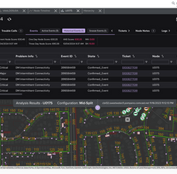
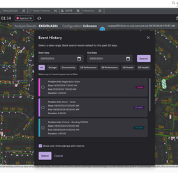
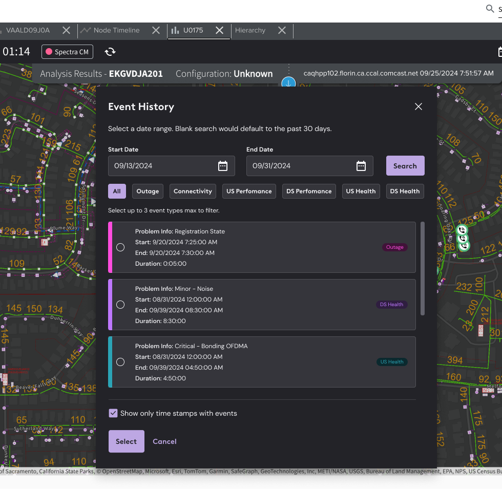
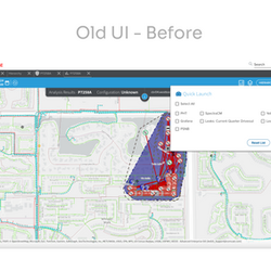
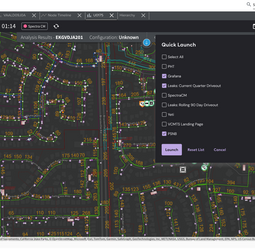
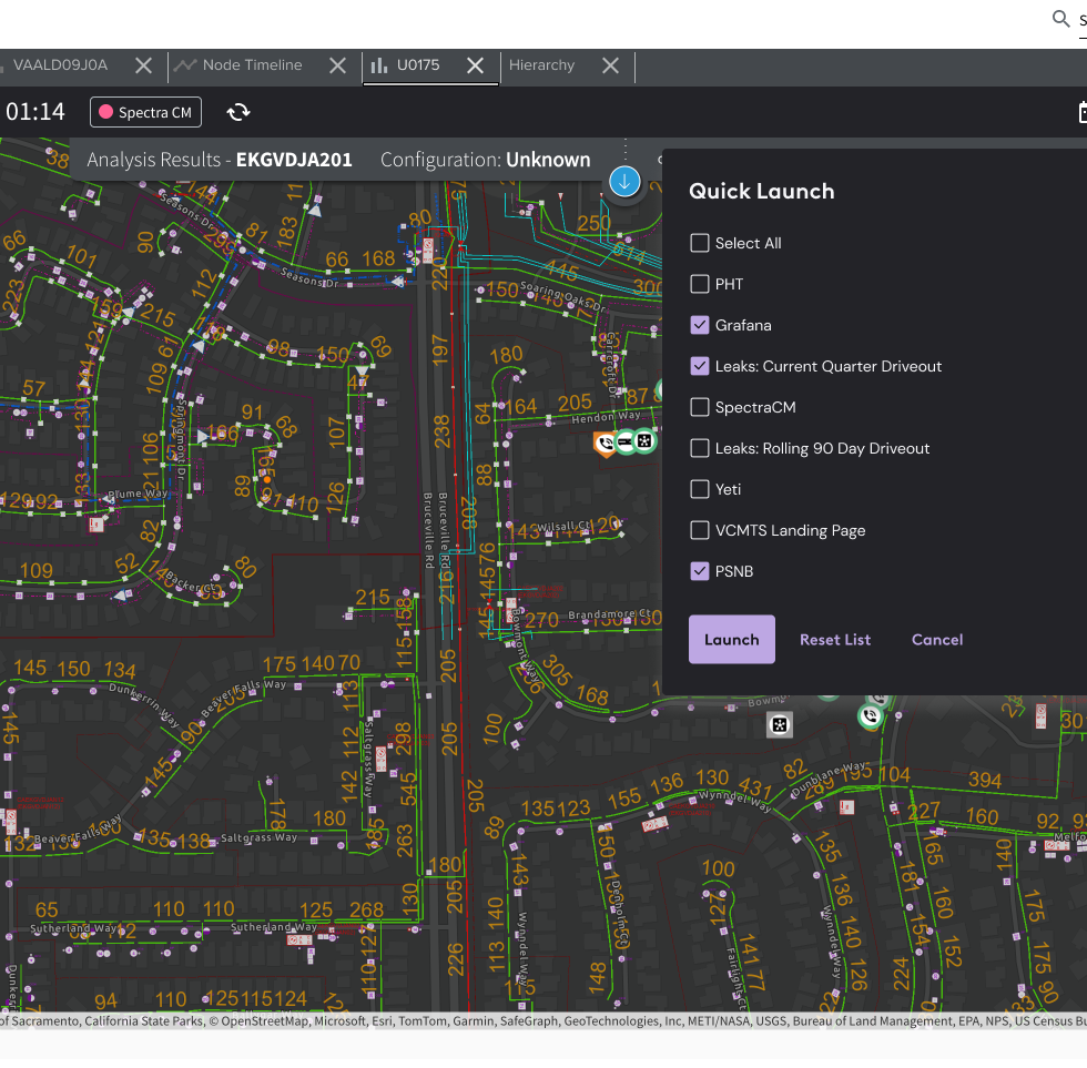
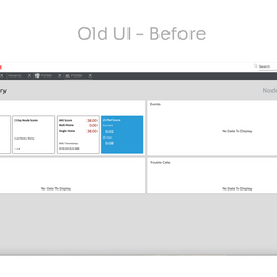
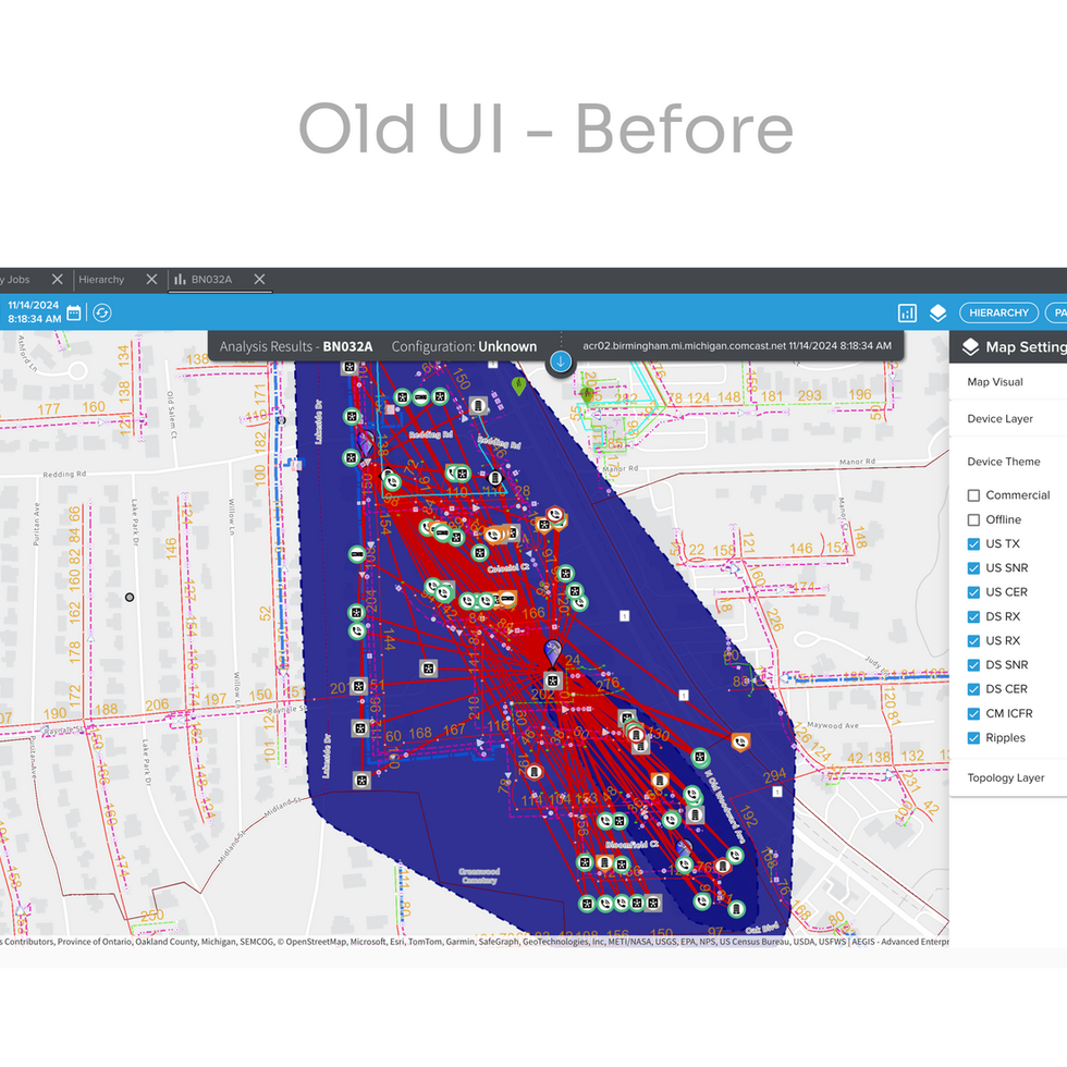
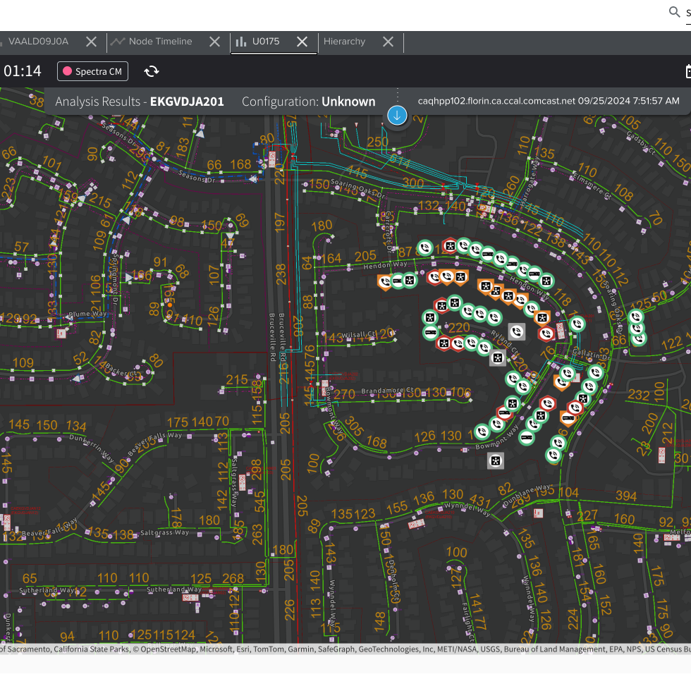
This design project involved refreshing the UI for several tools and components including side menus, modals, buttons, typography, iconography, nav bars and more. The work also included incorporating a full dark mode theme, focusing on improving usability and accessibility while maintaining visual consistency in both light and dark environments.
Role
UI/UX Designer
Problem + Impact
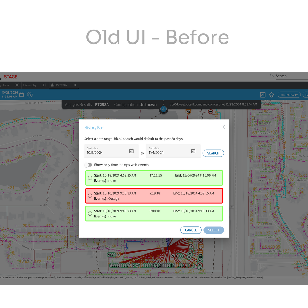
Technicians working night shifts encountered significant challenges with the user interface due to its overly bright screens. The high contrast between the bright background and the surrounding low-light environment caused eye strain, making it difficult to focus on tasks. Additionally, the interface lacked accessibility features like adjustable color contrast and text size, which made it even harder for some technicians to efficiently navigate through the tools and perform their duties.
To address this, a dark mode theme was implemented across the user interface. This solution reduced screen brightness, providing a softer contrast that was easier on the eyes during night shifts. By incorporating improved accessibility features like better contrast control, larger fonts, and clearer iconography, the dark mode not only improved visual comfort but also enhanced overall usability, allowing technicians to work more efficiently in low-light conditions.
Software Tools
Figma
Key Challenge(s)
I faced the challenge of updating a UI color palette where existing users were already accustomed to specific colors representing particular data. Changing these colors risked disrupting user workflows and causing confusion. To navigate this, I introduced a set of new colors to modernize the interface while carefully mapping each to existing associations. Additionally, I incorporated a badge system, which allowed users to visually reinforce the new color meanings with labeled indicators. This transition strategy helped users adapt to the updated palette gradually without losing familiarity, balancing the need for an improved aesthetic with usability.
Results
Improving accessibility significantly for technicians working late-night shifts, enhancing usability and reducing eye strain in low-light environments.
Adding the implementation of a new color palette that ensure accessibility across the entire tool for both light and dark mode themes.


